

 info@cultbooking.com
  0049 30 726225 0
 Source: depositphotos.com
Did this headline get your attention? That’s exactly what a great website header should do. As digital marketers and web designers, we know the power of first impressions.
Your header is often the first thing visitors see, and it can make or break their decision to stick around. What’s more, three-quarters of all visitors judge a website’s credibility based on how it looks. That proves design matters big time.
But creating a header that wows and converts isn’t always easy. To make things smoother for you, we’ll walk you through seven key elements that’ll turn your header into a conversion machine. We’ll show you how to grab attention, build trust, and guide visitors exactly where you want them to go.
By the end of this guide, you’ll have a ready plan to boost your site’s performance and keep those visitors coming back for more.
7 Elements of a High-Converting Website Header (+Examples)
1. Crafting a Compelling Value Proposition
Your value proposition is the heart of your header. It’s your chance to tell visitors why they should care about your brand in just a few seconds. A strong value prop grabs attention, sparks interest, and sets you apart from the competition.
To nail your value proposition:
- Keep it short and to the point. Aim for ten words or fewer.
- Focus on benefits, not features. What problems do you solve?
- Use clear, simple language. Ditch the jargon.
- Make it unique. Why should people choose you over others?
- Test different versions to see what resonates best.
When crafting your value prop, ask yourself: “What’s in it for my clients?” Then, put that front and center. Remember, it shouldn’t be about you but about what you can do for them.
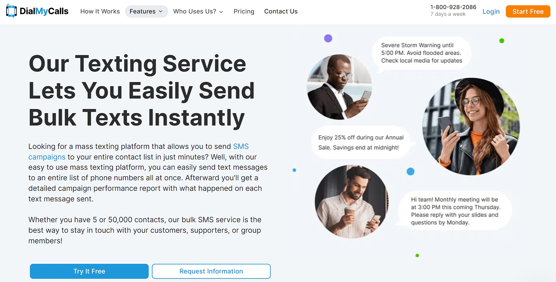
Let’s look at a real brand that employs this strategy. DialMyCalls, a service for easily sending mass texts, nails their value prop with: “Our Texting Service Lets You Easily Send Bulk Texts Instantly.”
It’s clear, concise, and tells you exactly what they do. They’ve avoided tech-speak and focused on the core benefit: easy group messaging.
Source: dialmycalls.com
This approach cuts through the noise and speaks directly to their target audience – people who need to reach many contacts at once. It’s a perfect example of a value prop that works hard in just a few words.
2. Showcasing Notable Endorsements
Social proof is a powerful tool that can boost your credibility in seconds. By displaying endorsements from well-known names in your header, you’re telling visitors that you’re already a trusted brand.
Think of it as a famous person vouching for you – suddenly, everyone wants to know more.
Here’s how to make endorsements work for you:
- Choose wisely. Pick endorsements that resonate with your target audience.
- Keep it fresh. Update your endorsements regularly to stay relevant.
- Be specific. Use quotes that highlight your unique strengths.
- Show faces. A photo or logo next to the endorsement adds authenticity.
- Don’t overdo it. One or two strong endorsements are better than a cluttered list.
The goal is to build trust quickly. Your endorsements should reassure visitors they’re in good hands.
Classical Guitar Shed, an online guitar learning platform, aces this tactic by featuring the logos of reputable educational institutions and well-known media outlets.
This endorsement works on multiple levels. It’s from respected names in the music education world, which immediately grabs the attention of aspiring guitarists.

Source: classicalguitarshed.com
By placing this endorsement front and center, Classical Guitar Shed instantly boosts its credibility and appeal to its target audience.
This strategy reassures potential students about the quality of the platform’s teaching and resources, making them more likely to enroll.
3. Creating a Sense of Urgency
We’ve all felt the fear of missing out. That’s exactly what creating urgency in your header taps into. It motivates visitors to take action now rather than later (or never).
By adding a dash of urgency, you’re giving that little push that turns browsers into buyers.
Here’s how to create urgency without coming off as pushy:
- Use time-sensitive language. Words like “limited time,” “ending soon,” or “today only” work wonders.
- Highlight scarcity. Phrases like “while supplies last” or “only 5 left” can trigger quick decisions.
- Add a countdown timer for special offers or events.
- Mention upcoming price increases.
- Offer exclusive deals for quick action.
The key is to be honest. Don’t create fake urgency – it can easily backfire. Instead, focus on real reasons why acting now is beneficial.
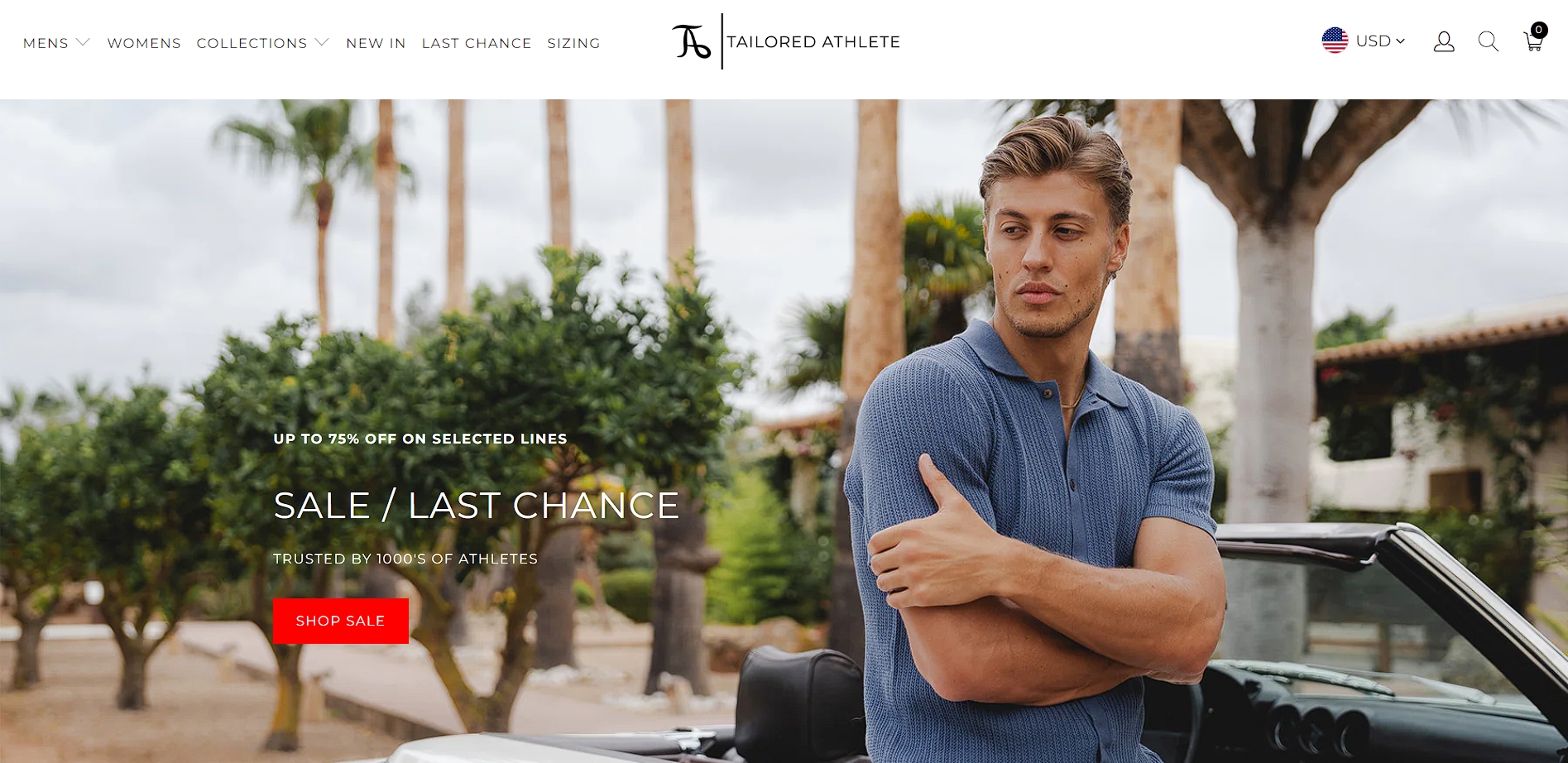
Let’s check out how Tailored Athlete, a brand specializing in athletic fit menswear, utilizes this tactic. Their header often features messages like “Up to 75% off on Selected Lines” or “Sale / Last Chance”.
Their discounted and limited-time offer creates a sense of exclusivity and encourages immediate action. It allows customers to feel like they’re buying great clothes while becoming a part of a select group that gets the best deals.
Source: tailoredathlete.co.uk
This approach works brilliantly for their target audience – fitness-conscious men who want stylish, well-fitting clothes. It’s also great for keeping their site dynamic and giving repeat visitors new reasons to buy each time they return.
4. Communicating Key Benefits Upfront
Why make visitors dig for reasons to love your product? Putting your key benefits front and center in your header allows you to grab their attention, show your value quickly, and help them decide if you’re the right fit for their needs.
This strategy is all about answering the “What’s in it for me?” question before they even ask.
Here’s how to highlight your key benefits right away:
- Know your audience. What matters most to them?
- Be specific. “Save time” is good, but “Save 3 hours a week” is better.
- Use icons or bullet points for easy scanning.
- Focus on outcomes, not features.
- Keep things concise. Aim for 3-5 key benefits.
Keep in mind that you’re not merely listing what you offer. You’re painting a picture of how your product or service improves your customers’ lives.
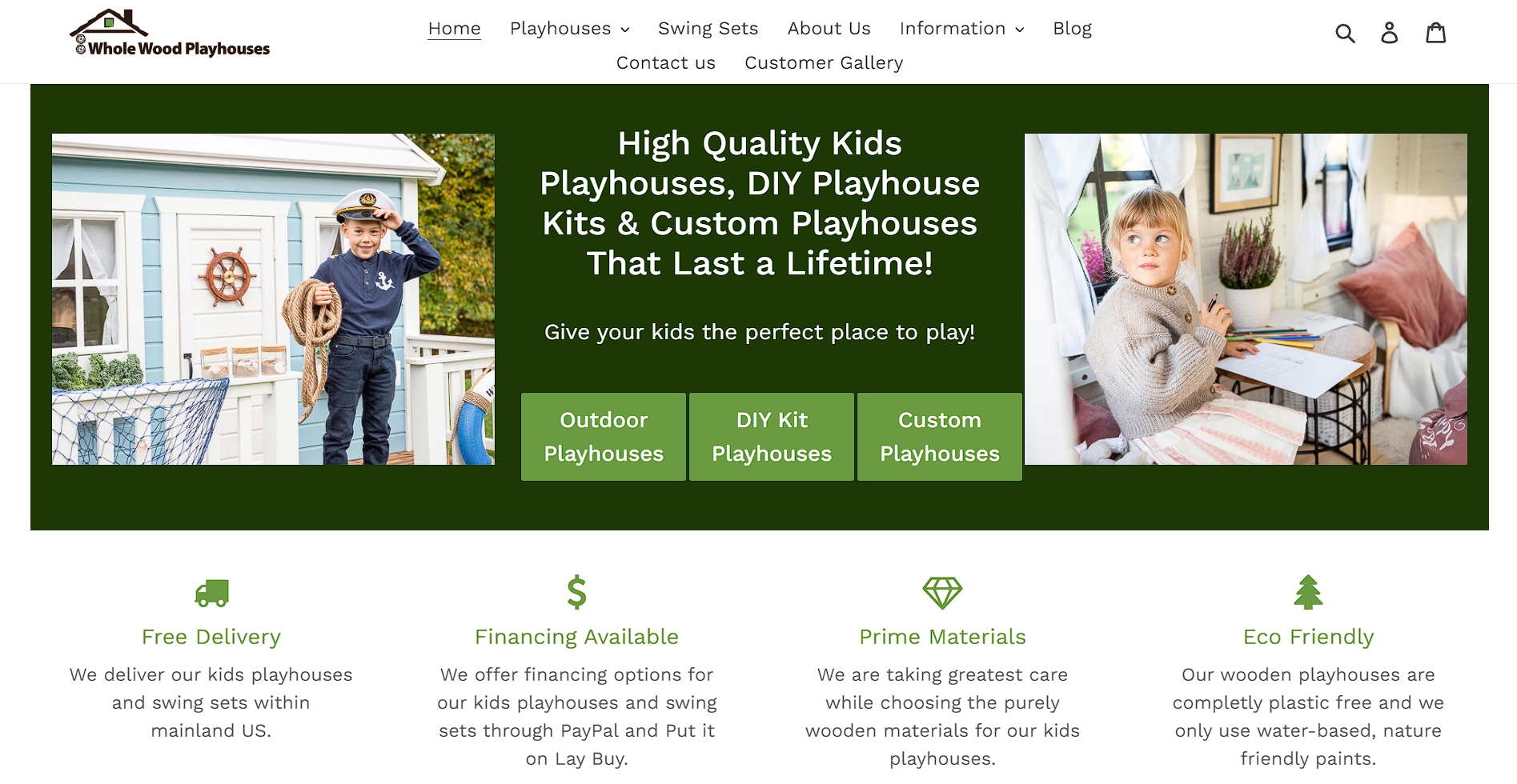
WholeWoodPlayhouses, a company selling ready-to-assemble outdoor playhouses for kids, communicates key benefits in their header.
They cut some common conversion obstacles by letting their prospects know that they’re eco-friendly, use premium materials, offer financing options, and provide free delivery.
Source: wholewoodplayhouses.com
This approach works wonders for their target audience – parents looking for quality play solutions who worry about health hazards, cost, and logistics.
That’s why WholeWoodPlayhouses address these concerns immediately and remove potential objections before they form. Their transparency builds trust and makes it easier for visitors to imagine themselves buying.
5. Building Credibility with Relevant Statistics
Numbers don’t lie. Sprinkling some key statistics in your header can act as a mini fact-checker vouching for your credibility right off the bat.
Stats provide concrete proof of your value, making your claims more believable and compelling. They turn vague promises into tangible benefits.
Here’s how to use stats effectively:
- Choose numbers that matter to your audience.
- Keep them current. Outdated stats can harm your credibility.
- Make the numbers easy to grasp. Use round figures when possible.
- Don’t overload. Pick 3-4 most impactful numbers.
- Use visuals like icons or mini-charts to make stats pop.
Know that less is more. Choose your most impressive and relevant stats rather than overwhelming visitors with numbers.
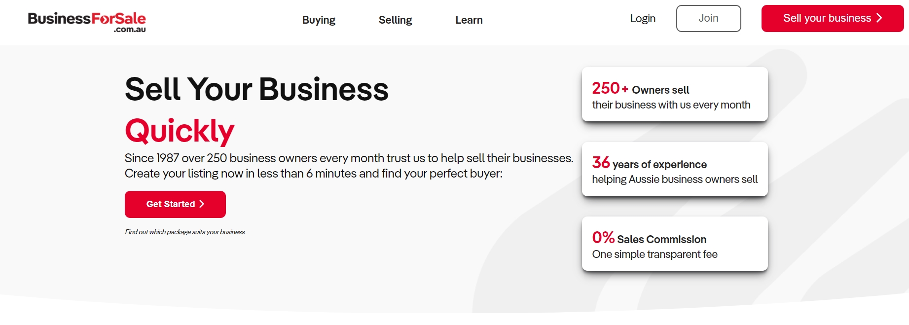
Australian Business For Sale, a platform for buying and selling businesses, mastered this tactic with header stats like “36 Years of Experience”, “250 Business Owners Every Month”, and “0% Sales Commision.”
Source: businessforsale.com.au
These figures are prominently displayed and supported by easy-to-understand explanations. Leading with these numbers allows them to instantly communicate experience, reach, affordability, and value.
This strategy helps to instill confidence in users looking to sell a business, driving engagement and conversions in the competitive niche of online business listings. It’s a powerful combo that speaks directly to what their users care about, making a strong case for why they’re the go-to platform in their industry.
6. Engaging Visitors with Product Previews
Engaging visitors with product previews is an effective strategy because it allows potential customers to visualize and experience the product before making a purchase.
Product previews provide a tangible sense of the product, which can reduce buyer hesitation and increase confidence. By allowing visitors to see the product in action or examine it closely, you create a more immersive and convincing shopping experience.
Here’s how to nail your product previews:
- Choose your best-seller or most eye-catching product.
- Use high-quality images or videos that show the product in action.
- Include brief captions highlighting key features.
- Make sure everything is mobile-friendly.
- Add a clear CTA to learn more or buy.
Andar, a brand specializing in leather wallets, bags, and cases, features a stunning hero image of their product in a natural setting.
But they don’t stop there. They add an interactive twist by including a clickable button right on the product. When visitors click this button, a small popup appears. It displays the product up close, along with its name, price, color options, and a link to its product page.
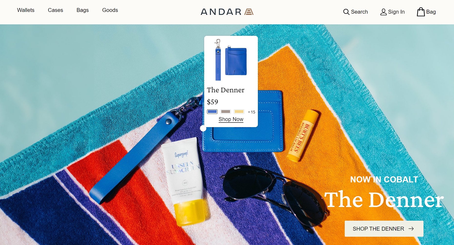
Source: andar.com
This clever approach does double duty. It shows off the product’s sleek design and practical use, while also giving visitors a taste of the shopping experience.
It combines beautiful imagery with interactive elements to create an engaging header that catches the eye and encourages exploration and purchases.
7. Prioritizing Accessibility
If your site isn’t easy to use, visitors won’t stick around. That’s why making your header accessible is a must.
An accessible header doesn’t just expand your audience – it shows you care about all your visitors. Plus, it often leads to a cleaner, more user-friendly design that everyone appreciates.
Here’s how to boost your header’s accessibility:
- Use high-contrast color schemes for better readability.
- Ensure the text is large enough to read easily.
- Add alt text to all images for screen readers.
- Make sure your header works well on mobile devices.
- Use clear, descriptive labels for navigation links.
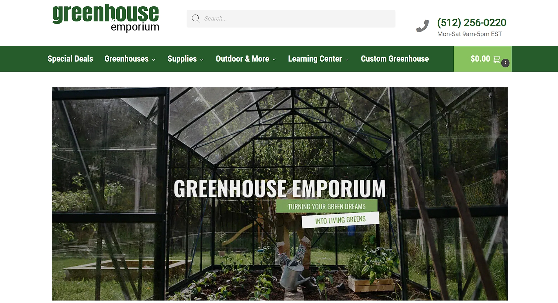
Greenhouse Emporium, a retailer specializing in gardening and greenhouse supplies, embraces accessibility in their header design with clear, easy-to-read text and a simple, intuitive layout.
Source: greenhouseemporium.com
This works great for their diverse audience of gardening enthusiasts. The header features high-contrast text that’s easy to read, even for those with visual impairments. Navigation buttons are large and clearly labeled, making them easy to use on both desktop and mobile.
Through this strategy, Greenhouse Emporium ensures that all gardeners, regardless of age or ability, can easily find the tools and supplies they need. This inclusive approach helps them broaden their customer base while reinforcing their image as a brand that cares about all customers.
Final Thoughts
These seven elements can be your toolkit for creating a header that looks great and drives excellent results.
From crafting a compelling value proposition to prioritizing accessibility, each of our tactics plays a vital role in capturing and retaining your audience’s attention.
But don’t let them sit pretty on paper – put them into action. Pick an element to focus on and experiment with it. Whatever you choose, keep testing and refining. Your perfect header is just a few tweaks away.