6 Essential Elements of a High-Converting Landing Page

What assets do you need to grow your online business?
A well-designed website is a must. A social media presence is a huge plus. And a content marketing strategy is a highly-efficient way to raise awareness about your brand and solutions.
But if you’re looking for an asset that will help you capture leads, boost free trial sign-ups, and drive sales, you need a high-converting landing page.
The truth about landing page conversion rates is that most businesses achieve a success rate of approximately 4%. And while that may seem like an acceptable CR, it still leaves room for improvement.
Fortunately, there are several easy-to-implement design strategies you can use to improve landing page conversions. Including specific elements on these web pages can and will encourage more visitors to turn into leads, newsletter subscribers, or buyers.
So, if you’re interested in boosting the CR of your most essential online assets, here are the must-have categories of landing page elements you need to employ to create a high-converting landing page.
Category #1: The Engaging Hero Section
The hero section of your landing page — the first thing your prospects see when arriving on your website and the space where they spend most of their web browsing time — will extensively impact your audience’s initial impression of your brand and determine whether consumers will be prepared to invest in your solutions.
So, if your business goals include improving landing page conversion rates, it’s a good idea to spend some time enhancing the topmost section of your most important online assets.
Generally, two elements will allow you to do this.
1. Attractive Header Visuals
Humans are visually-driven creatures. They process images 60,000 times faster than text. And some theories, like the picture superiority effect, suggest that people remember considerably more information consumed via images.
That’s why capturing your prospects’ attention necessitates visual elements positioned in the one place where they’re guaranteed to be noticed — the header.
Whether you employ photos, illustrations, negative space, or videos depends on your brand’s visual identity. But you can rest assured that getting the graphics right equals a much higher conversion rate than presenting your audience with a bland section focusing only on making a sale.
Do your best to choose attractive and exciting visuals that reflect your solution’s benefits.
For inspiration, check out the video on the Aura homepage, which shows an astronaut walking to their next mission. This is a metaphor for the mission small business owners embark on when employing the brand’s solution to maximize Amazon sales.
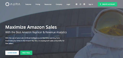
Source: goaura.com
Or, if you’re more into a no-frills approach to design, you could take inspiration from brands like ClickUp. They utilize product screenshots to show prospects the full potential of their solutions.
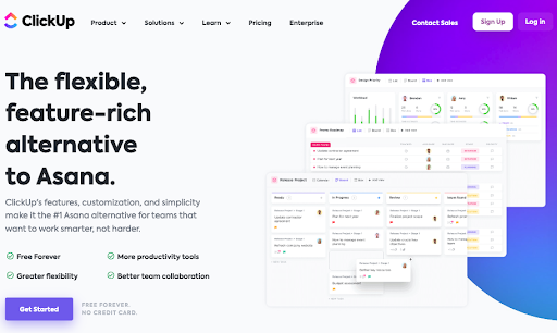
Source: clickup.com
2. Spot-On Headlines
The second essential element of a high-converting landing page header is a headline describing what your business offers.
The traditional way to write headlines is to state what your product does in a way that’s concise, easy to understand, and appealing. However, if you’re looking to maximize conversion rates, it’s not a bad idea to approach the copywriting process from a user-oriented point of view. After all, personalization plays a significant role in improving consumers’ shopping experience and, according to the latest data, could be the key to boosting conversions and customer lifetime value.
To guarantee that your headlines appeal to potential buyers, address your target audience’s pain points and describe how your product fits their needs. Or, even better, directly mention the people your solution was created for. A great example of a company doing this well is pet insurance brand Pumpkin. They state that their service is developed “for people who’d do anything for their pet.”
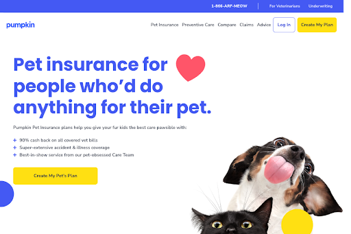
Source: pumpkin.care
Don’t hesitate to mention your target audience’s frustrations — as done by Tailored Athlete in saying that their trousers are specifically designed for a muscular physique, with “no need to size up to allow for [buyers’] quads.”
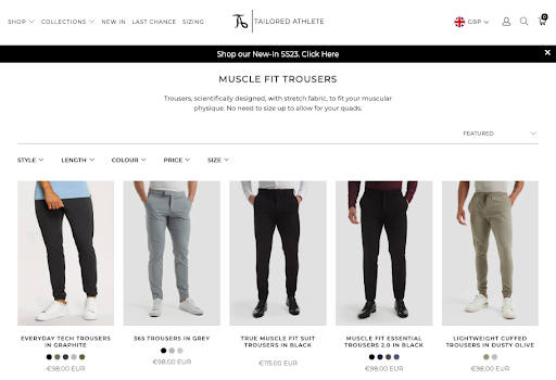
Source: tailoredathlete.co.uk
Furthermore, see if you can appeal to your prospects’ fear of missing out or even adopt a witty approach and communicate your unique value proposition through humor.
Category #2: Calls to Action
The second category of essential elements that will allow you to improve landing page conversions includes the various CTAs you need to position throughout the page.
Take a look at the traditional approach to web design. You’ll notice that most landing pages employ a single, sales-oriented CTA button inviting web visitors to “shop now,” “sign up,” or do something along the same lines.
However, when trying to improve conversions, you must remember that your prospects’ intention isn’t necessarily to spend money. Instead, it’s to solve their pain point once and for all.
With this in mind, you must optimize landing page CTAs to address your audience’s needs.
For example, do your prospects populate the top-to-mid phases of the buyer’s journey where they want to buy a product but haven’t found the right option yet? Well, why not use CTAs to help them identify the perfect solution to their needs? You’ll find a great example on the Shop Solar Kits homepage, which includes a “Find your solar kit with our quiz” button.
Source: shopsolarkits.com
Or, if you offer a complex solution that does more than just one thing, you’ll likely want to create a landing page that addresses the various benefits of your product. Why not do what Mailchimp does on its Website Builder landing page and create multiple CTA buttons, with each one inviting web visitors to take advantage of a different benefit described on the page?
Source: mailchimp.com
Lastly, to optimize CTA buttons to boost CRs and capture leads still on the fence about investing in your solutions, it might not be a bad idea to adopt a subtle approach that doesn’t immediately rope them into making a purchase. Something as simple as inviting people to “schedule a free consultation” or “book a call,” as done on Trustshoring, can be an excellent alternative to the hardball sales strategies used by most brands.
Source: trustshoring.com
Category #3: Trust, Transparency, & Security
As you should well know, trust has an irreplaceable role in encouraging people to invest in your brand’s products or services. According to the latest data, 49% of consumers are inspired to invest in a company’s solution by trust. Furthermore, 33% will pay a premium to acquire products or services from trusted organizations.
So, if you’re looking for elements that will boost landing page conversion rates, look for ones that communicate your brand’s trustworthiness, expertise, credibility, and commitment to transparency and user security.
-
Social Proof
The most standard way to build brand and product trust is to enhance your website with instances of social proof. Of course, you can choose from several varieties of social proof for your landing pages.
Product and service reviews fall at the more traditional end of the spectrum. Yet, knowing that almost 70% of consumers read between one and six reviews before making a purchasing decision, it’s only natural that you should include this type of testimonial on your site.
Alternatively, you could also use video reviews, like the one shown on the SellerPlex homepage. Video reviews allow you to utilize the engagement potential of the video format and combine it with the conversion-inspiring power of testimonials.
Source: sellerplex.com
Or, for an even more advanced approach to landing page social proof, you could consider employing case study highlights, like the one featured on Contentful. What stands out about this brand’s approach to social proof is that each (well-known) client’s positive feedback is enhanced with numbers and quotes that support the brand’s reputation as a provider of high-quality solutions.
Source: contentful.com
-
Security Certificates, Transparency Promises, & Award Badges
Certificates and badges are another highly-efficient landing website component to drive brand credibility and push on-the-fence prospects toward a conversion. And, seeing that they can be used in numerous positions on your website, they can be a great addition to other conversion-boosting elements like USPs and CTA buttons.
On the one hand, you can make these badges a core part of your website header, using them to support your claims and reassure your audience that your brand will keep its promises. For an excellent example of this strategy in action, check out the GoodDay homepage. You’ll see that the first screenful of the homepage includes a list of clickable quality certificates from relevant industry authorities like Capterra and G2.
Source: goodday.work
Alternatively, you could save these badges for the footer section of your landing pages.
Or, even better, employ them in a way that builds credibility via transparency. Take a look at Athletic Greens, where the certificate badges accompany a CTA inviting potential buyers to check out the ingredient list for the brand’s product.
Source: athleticgreens.com
-
Contact Options
Finally, don’t forget that your experts make your organization’s most valuable weapon. And, if you can get your prospects to understand that they’ll be getting a first-class solution from your brand, they’ll be far more likely to make up their mind about making a purchase.
So, knowing that proving your expertise (and consequently boosting conversions) depends on having the opportunity to speak to potential clients, why not use contact options to improve the effectiveness of landing pages?
Whether this is a clickable phone number, a social follow button, or a semi-automated chat widget — like the one on the SoftStart website — is entirely up to you. What matters is that your audience knows that you and your team are there for them and that they can rest assured that all their questions will be answered so they can sleep easy knowing they’ve made the right buying decision.
Source: softstart.app
Final Thoughts
There you have it — the vital elements to include on your landing pages to achieve impressive conversion rates.
The great thing about the webpage components discussed in this article is that they’re all relatively easy to add with just a few design tweaks. And if you approach the process in a step-by-step manner, you can even measure the impact of each element, allowing you to optimize them to facilitate your goals.
So, if you don’t use them already, don’t hesitate to start now. After all, most of these changes are improvements you can make on your own, meaning that there are no excuses for not jumping at these opportunities to nurture conversions and business success.
 info@cultbooking.com
  0049 30 726225 0