 Source: depositphotos.com
Creating a beautiful and functional website is essential for presenting your business in a positive light. Considering that visual and UX design significantly influence web user behavior (specifically, their shopping intent), you’ll want to learn how to make web design work in your brand’s favor.
Still, the truth about creating a seamless user experience on your business website is that it’s not always an entirely straightforward process. Yes, adhering to best practices is an excellent start toward boosting conversions and improving your brand’s reputation. Nonetheless, achieving genuinely impressive results necessitates a slightly more involved research, development, and testing process.
So, if you want to guarantee that investing in your website truly pays off, here are the best ways to use UX tactics to drive conversions and improve your brand’s reputation.
Start With Some Basic Technical Performance UX Improvements
Focusing on site speed or mobile responsiveness may not seem exciting. And it may not even appear impactful in terms of your bottom line.
Nevertheless, research shows that fundamental UX improvements in your site’s technical performance make a huge difference to your brand’s ability to delight and convert your target audience.
For example, a 10-second delay in site load times could increase your bounce rates by as much as 123%. Moreover, considering that over 50% of all global web traffic comes from handheld devices, designing a website that looks and performs well on small screens is non-negotiable.
So, if you want to do the bare minimum to guarantee your website leaves a positive first impression on your target audience, do your best to optimize your website for speed, responsiveness, and accessibility.
Moreover, ensure you understand how visual design choices — like color schemes, contrast, and layout — impact your site’s usability. The goal is to create an intuitive browsing experience at every stage of the buyer’s journey.
Essentially, your website needs to present visitors with the right elements at the right time. It should direct visitors’ attention toward high-value components (like value propositions, CTAs, and trust signals). Finally, it needs to work in a way that will benefit your business by establishing its authority or inspiring conversions.
But how do you achieve all these things? Well, it might take some trial and error. But, a good rule of thumb is to explore examples of brands that have successfully employed UX design to boost credibility and encourage conversions.
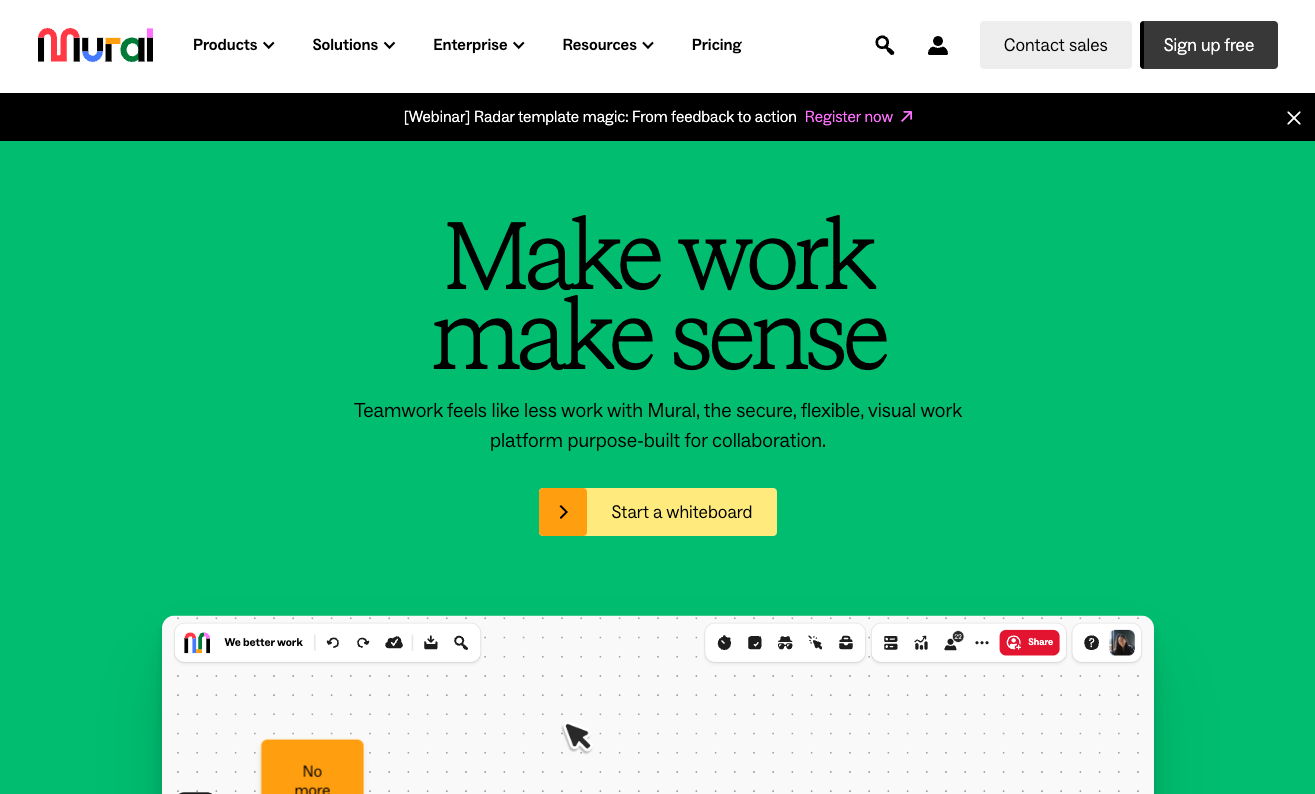
For instance, check out Mural. This SaaS brand created a homepage that immediately draws web visitors into the brand’s software. The use of visual hierarchy makes it easy for new prospects to comprehend what the solution offers. The layout encourages CTA button clicks and scrolling. Lastly, the content presented on the homepage effectively communicates business credibility, boosting this brand’s potential for capturing new leads and customers.
 Source: mural.co
Additionally, when trying to use UX to drive conversions, consider your audience’s needs and wants. Map out their buyer’s journey and create a site structure to help them get the answers/solutions they need within a few clicks.
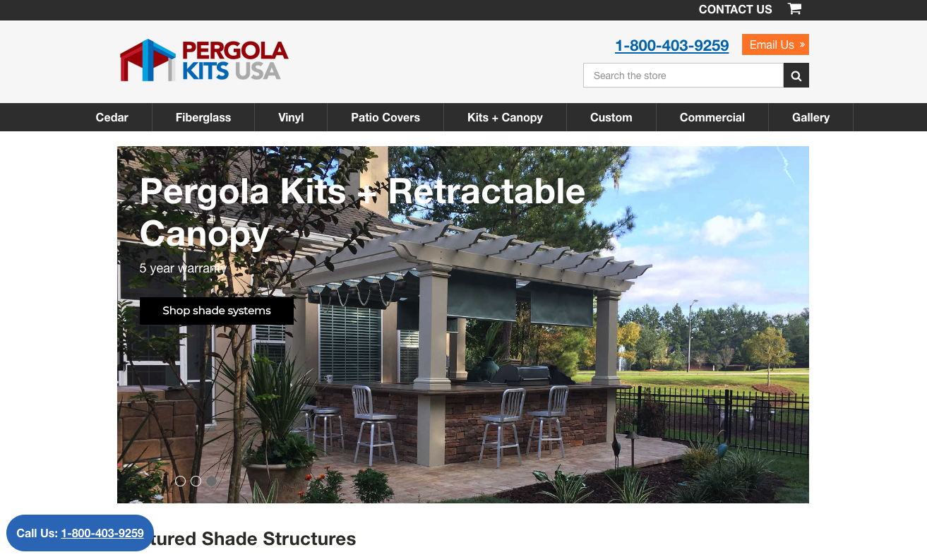
On the one hand, you can do this by simplifying your site’s navigation and making it super-easy for web visitors to browse your offer. This is what Pergola Kits USA does for its product categories, encouraging leads to choose the type of solution they’re after (Cedar, Fiberglass, Vinyl, Patio Covers, etc.).
 Source: pergolakitsusa.com
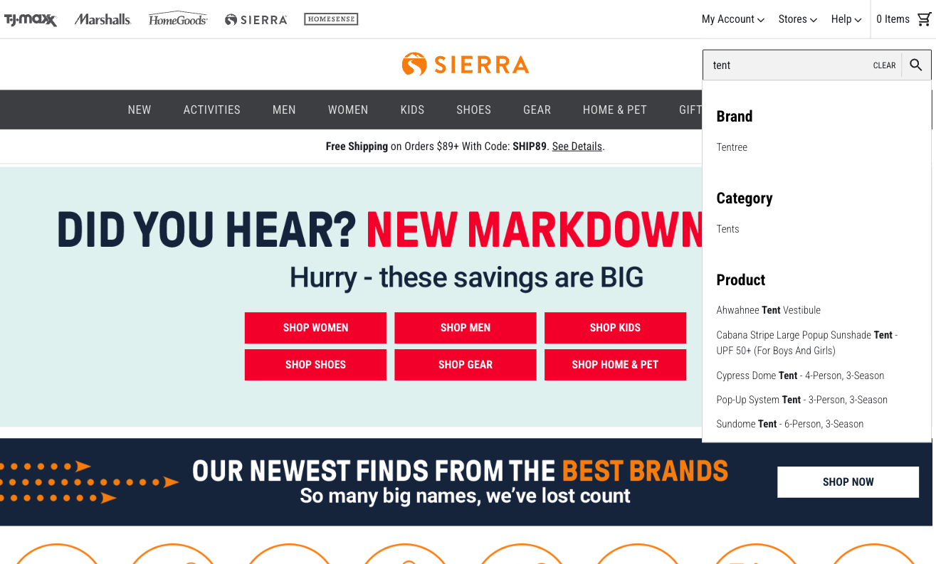
On the other hand, you can develop a powerful search option for your website, similar to the one on Sierra. This is an excellent tactic to inspire purchases and shorten the sales cycle, especially considering that 69% of shoppers instantly zoom in on the search bar when landing on a website.
 Source: sierra.com
Make Social Proof an Ever-Present Part of Your Site’s Appearance
Did you know that 88% of people consider brand trust essential when making purchase decisions (closely following value for money and quality)?
With this in mind, you need to incorporate social proof elements into your site’s UX design if you want to grow brand trust and drive conversions.
But here’s the deal. Traditional instances of social proof, like ratings and reviews, work well enough to show your prospects that your business is a credible entity that can solve their pain points. Still, explore ways to use UX design tactics to guarantee web visitors notice and interact with these conversion-inspiring elements.
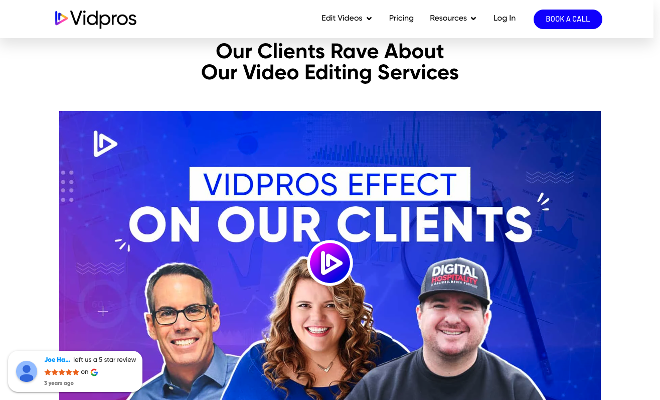
For example, check out Vidpros. This brand’s homepage is filled with social proof that practically follows the web visitor’s browsing journey. In addition to the floating Google reviews element that pops up every few seconds, the brand also shows off relevant trust signals like client profiles, logos, customer stories, and several examples of its work.
Source: vidpros.com
Or, you could even apply a more strategic approach and intentionally position social proof (or trust signals, in general) in specific sections of your website where people decide whether or not to buy from your business.
For example, consumer research shows that people often disregard products with a star rating below four stars. So, Helly Hansen doesn’t just prominently show off star ratings on its product pages. It does the same on collection pages, too, where most consumers start their product evaluation process and go one step closer to making a purchase.
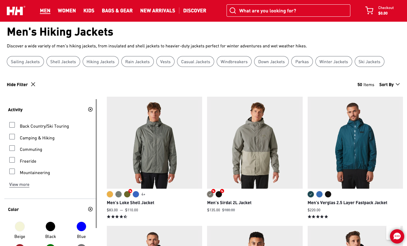
Source: hellyhansen.com
Utilize Interactive Content Formats to Explain Your Solutions
We know that consumers want to buy from brands that can prove their authority and credibility. But is there anything else they want businesses to do to convince them to invest in a product or service?
According to recent survey data, 79% of shoppers want companies to demonstrate they understand and care about them.
So, to boost conversions and customer relationships, why not utilize your site’s UX design to prove your commitment to removing your prospects’ pain points?
For example, one excellent way of doing this is to choose the right content formats for your landing pages. By prioritizing engaging and attractive explainer elements, like videos, you can effectively convince website visitors that you understand their needs. Plus, you can instantly introduce them to your solution, which is the ideal answer to their needs.
Check out how Rosie does it on its homepage. This brand invites potential customers to watch a demo of its software’s capabilities. By using video to explain a few specific features, Rosie ensures that its potential buyers understand the unique value of the product. But more than that, the choice of video format encourages viewers to imagine situations where they could benefit from implementing the Rosie AI in their workflows. This effectively encourages them to see Rosie’s offer as more relevant. Plus, it significantly increases their chances of converting.
 Source: heyrosie.com
Of course, you don’t necessarily have to use video to show your potential customers you have the expertise to solve their pain points.
In some cases, good copywriting combined with a user-friendly layout will be more than enough to prove your brand’s trustworthiness.
Just check out how Pinch does it. By separating its Mobile IV Therapy process description into the Before, During, and After categories, this brand expertly explains its services. Plus, by describing the process, Pinch sets its prospects’ expectations to the right level to ensure post-purchase satisfaction.
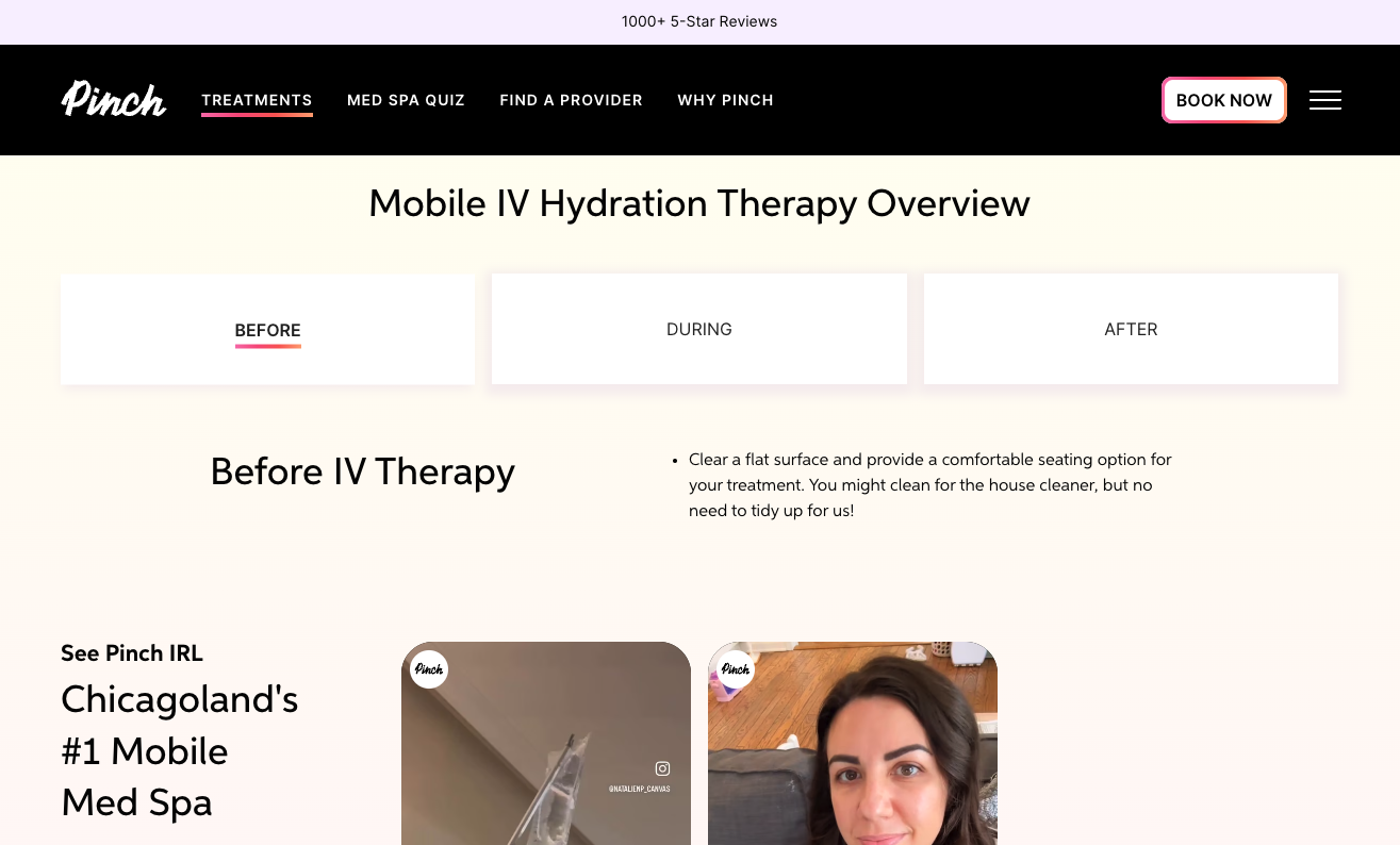 Source: bookpinch.com
Use UX Design to Create Intuitive Shopping Experiences
Sometimes, the best way to use UX design to enhance conversions isn’t just to add website features that will encourage sales. Instead, it’s to remove any elements or processes that may be causing web visitors to become frustrated and give up on buying from your brand.
If you look at the research on what causes online shoppers to not convert, you’ll find that it includes several factors like lack of price transparency, complicated checkout processes, website errors, lack of payment methods, etc.
So, if you want to drive conversions with UX design tactics, start by creating a smooth and intuitive shopping experience for your customers.
First and foremost, do your best to make product evaluation and selection as easy as possible.
Provide consumers with any necessary product info by creating detailed descriptions and using plenty of high-quality photos. Include size charts and FAQs, and use instructions on product pages to help your prospects form a clear idea of how to get the most out of their purchase. And try to make the shopping process self-sufficient.
For example, check out how EXT Cabinets does it on its 10k Outdoor Kitchen product page. Even though the brand knows that building the ideal set-up takes a long time, it still allows buyers to choose all their preferred finishes online. Why? Because this is a creative process. And customers need to feel free to play around with their choices. So, instead of forcing potential buyers to call or send emails (which many don’t want to do in the first place), EXT allows them to create their orders online. That way, consumers get to explore various customization options and build the ideal outdoor kitchen for their specific needs.
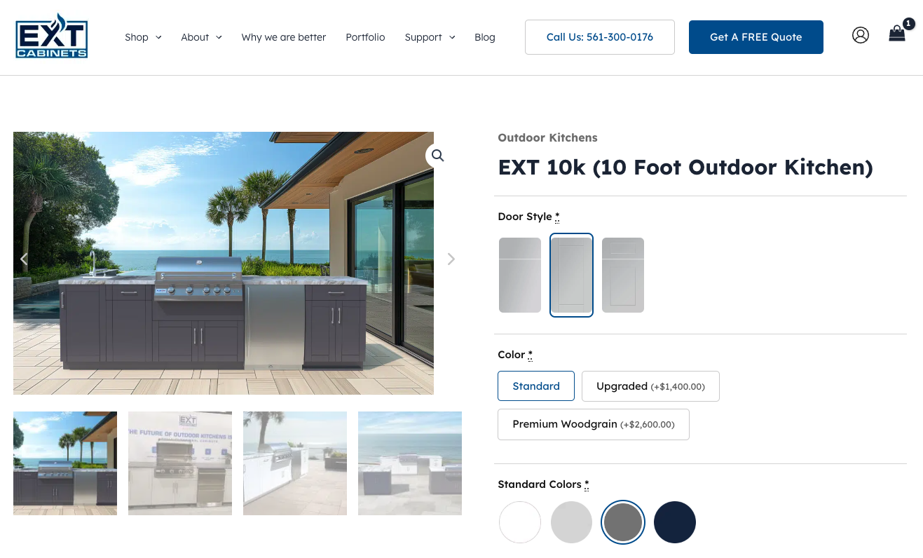 Source: extcabinets.com
Secondly, when using UX tactics to drive conversions and boost brand credibility, think about creating shopping experiences that will make your customers return to your site.
By simplifying or automating the checkout process, you can enhance customer retention. Plus, doing something as simple as enabling product subscriptions could help you increase customer lifetime value and give your customers a convenient and enjoyable brand experience they’ll happily recommend to others.
This is precisely what Transparent Labs does on the Hydration Powder product page. Knowing this is a consumable product, the brand encourages buyers to buy a subscription (offering them a 10% discount and free shipping as an incentive). Ultimately, this makes the buyers’ lives easier because they don’t have to think about reordering items they’re running out of. For Transparent Labs, it means higher customer satisfaction and retention rates, helping it build its reputation as the go-to business in the sports supplements industry.
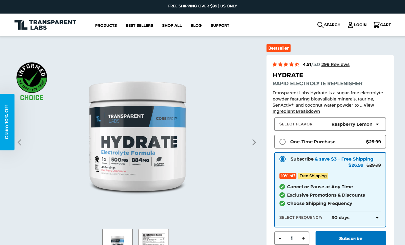 Source: transparentlabs.com
Final Thoughts
Using UX design to create an enjoyable shopping experience for your customers can be a complex process. But seeing how impactful it can be — especially for boosting sales and enhancing brand credibility — it’s more than worth the effort.
To guarantee you’re getting the best possible results, always base your design decisions on target audience research. Then, to be sure you’ve made the right choice, test your site’s performance and see if there are any additional improvements you could make.
Sure, the process might take time and effort. But in the end, it’ll be worth it — especially if you want to become an industry leader that consumers will aspire to buy from.


 info@cultbooking.com
  0049 30 726225 0