Problem:
CultBooking, encountered following flow when comes to design, development and functionality, when inserting a long text description for the any room category of a property hotel or overnight stay: the text would make the booking engine mask become longer in vertical shape. This causing the need to scroll down quite a long way to see the rest of rooms and the room rates of the property.
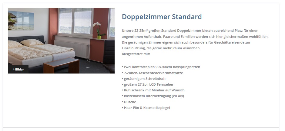
Here is how the Booking Engine would look before making any change or improvement of design:

It can be clearly seen that the room characteristics represented by the bullet points are surpassing the inferior part of the room image, making the page longer.
Solution
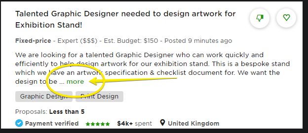
CultBooking designer and project management team analyzed how other websites approach this design flow and identified one example that looks modern and is the right solution for the Booking Engine. Here is where we got inspired from:

End result
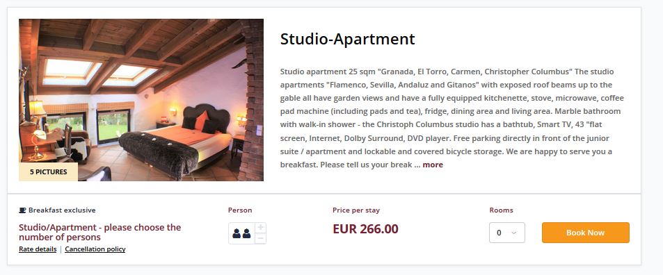
CultBooking developers started to implement inmediately the idea and in couple of hours we were able to see results. Some adjustments were needed to make the UI/UX design look good and be improved. In the end, an excellent enhancement has been released. Please see below the end result:

For questions and help, you can reach us via the contact form or directly by email: info@cultbooking.com


 info@cultbooking.com
  0049 30 726225 0